Artwork Guidelines
Please find our Artwork Guidelines here


Click the button below to download the guide for how-to setup your file based on your design software
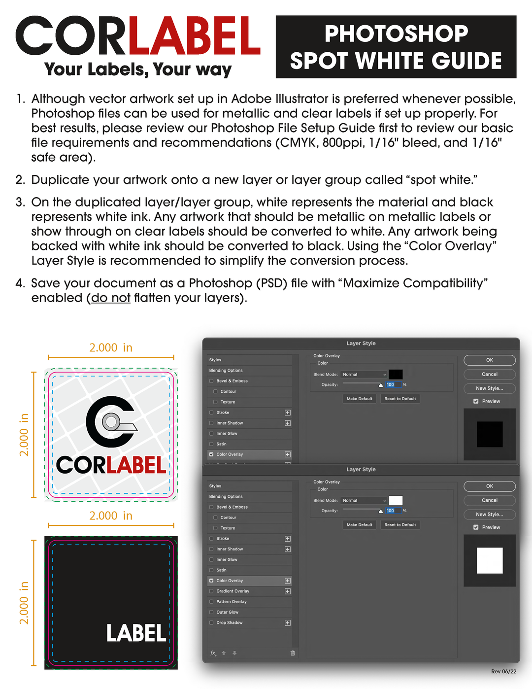
Photoshop File Setup Guide for Metallic, Clear and Holographic Labels
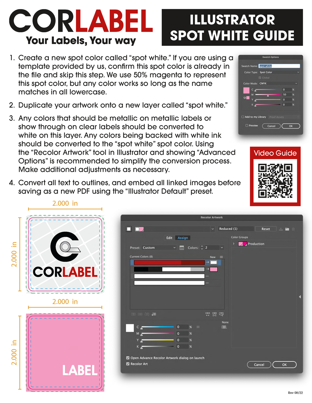
Illustrator File Setup Guide for Metallic, Clear and Holographic Labels
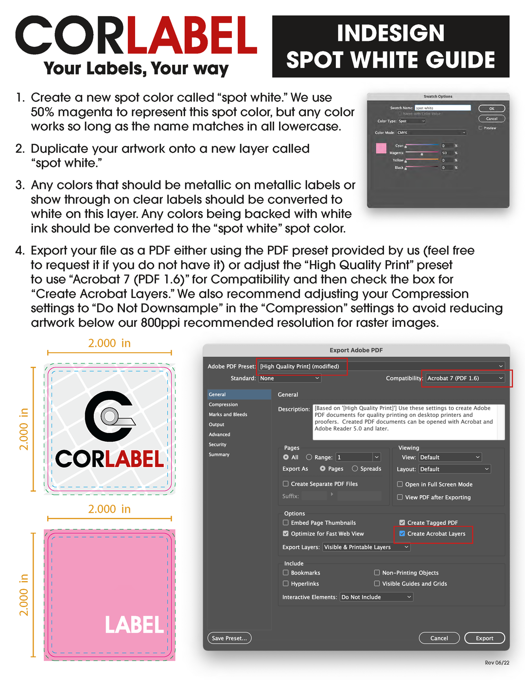
InDesign File Setup Guide for Metallic, Clear and Holographic Labels
Unwind direction refers to the orientation in which the label comes off the roll when it is being dispensed or applied to the product. It is an essential consideration in label printing and application processes to ensure that the labels are correctly positioned and oriented for application.
The unwind direction is represented by numbers typically (unwind #1, #2, #3, #4,) however it is important to note there are a total of 8 unwind directions. Each number corresponds to a specific way the labels unwind from the roll. The specific unwind direction is crucial to match the requirements of your labeling machinery or co-packing process. Here's how to determine the correct unwind direction:
● Consult Your Co-Packer or Machine Specs: If you are working with a co-packer or using label application machinery, they will likely specify the required unwind direction for the labels. Co-packers and labeling machines are designed to work with specific unwind orientations, ensuring smooth and efficient application.
● Understand the Unwind Direction Numbering: The unwind direction is typically represented by numbers 1 to 8, each corresponding to a specific orientation. For example, unwind #1 might mean the label unwinds from the top of the roll, while unwind #3 might indicate the label unwinds from the bottom of the roll.
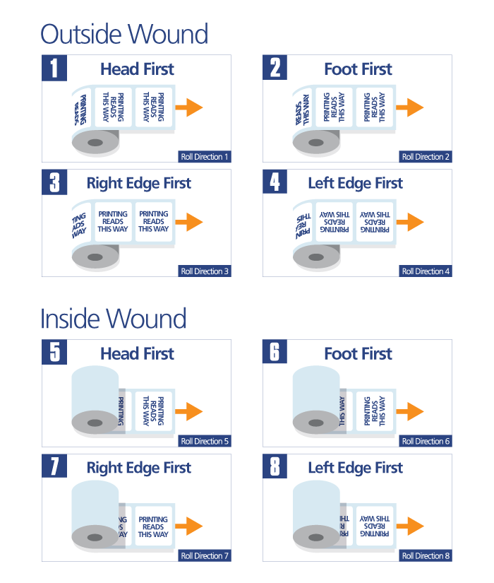
Choosing the correct unwind direction is vital to ensure efficient label application and avoid any misalignment or issues during the labeling process. By understanding your co-packer's or machinery's requirements and communicating them clearly to the label manufacturer, you can ensure that your labels are supplied in the appropriate unwind orientation for your specific application needs.
Both rounded corner rectangles and square corners have their unique visual characteristics, and the choice between them depends on the desired aesthetics and brand identity for your labels. Rounded corners tend to create a modern and friendly feel, while square corners offer a more traditional look.
CMYK (Cyan, Magenta, Yellow, Black) is a color model used in printing to reproduce a wide range of colors by mixing different percentages of these four ink colors. It is also known as the "4 color process" because it uses these four primary ink colors to create a full-color image.
In the CMYK color model:
When printing in CMYK, tiny dots of these four ink colors are applied in varying densities to create a wide spectrum of colors, shades, and tones. By overlapping the dots in different patterns, the printer can produce the illusion of continuous tones and reproduce high-quality images and graphics.
CMYK printing is commonly used in the printing industry for producing full-color materials like brochures, labels, magazines, and other marketing materials. It is the standard color model for most digital and offset printing processes.
When designing your labels, it is essential to work in the CMYK color space to ensure the colors you choose on your computer screen accurately translate to the printed labels. Some colors that are easily represented on digital screens (using the RGB color model) may appear differently when printed in CMYK, so it's essential to check proofs and test prints to achieve the desired color accuracy and quality for your labels.
Choosing the size of your label is an important decision that should be based on several factors to ensure it fits your application and enhances the overall presentation of your product. Here are some steps to help you determine the appropriate label size:
By considering these factors, you can choose the right label size that not only fits your product container but also effectively communicates your brand message and product information to your target audience.